|
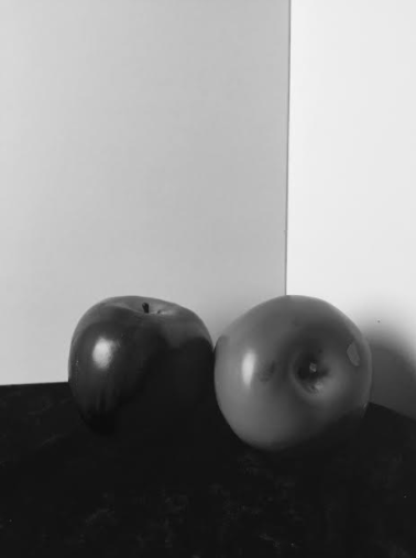
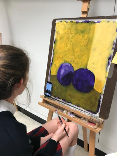
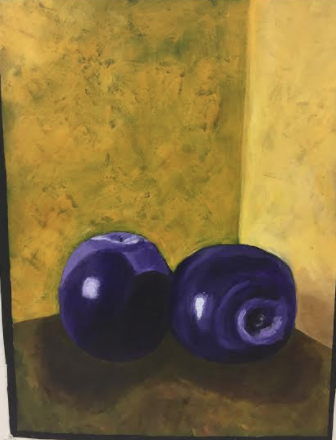
I began this project by arranging two apples in a dark room with one light source and then I took a photo. I then made the photo black and white because it helps me to see the different values better. I like using a photo for reference because it helps me to do the proportions and values. I then chose my two complementary colors, yellow and purple. I chose yellow and purple because I liked the way they complemented each other. I started by painting the background purple. I then painted some guidelines for where the yellow background would be, and then I drew in the apples with charcoal. After I drew the apples I started painting the background yellow over the purple. I did this because it gave the piece more depth. I then brought the values into the apple. I lasted added the shadows and painted the black outline around the piece. I really like the way this piece turned out. This is my favorite piece that I created this semester. Creating this painting taught me how to create values and proportions better.
0 Comments
Leave a Reply. |
AuthorThis Blog is for me to express my process for each piece that I create. Archives
December 2017
Categories |
 RSS Feed
