|
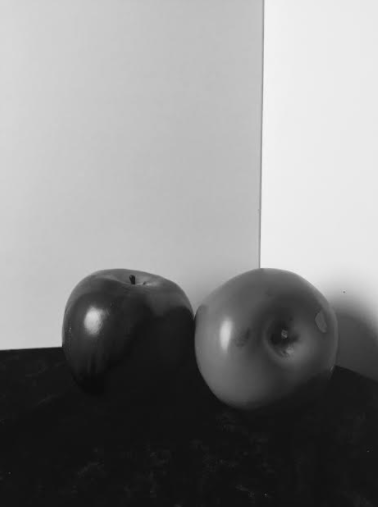
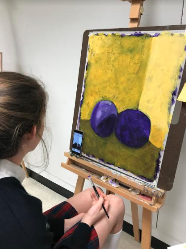
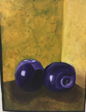
I began this project by arranging two apples in a dark room with one light source and then I took a photo. I then made the photo black and white because it helps me to see the different values better. I like using a photo for reference because it helps me to do the proportions and values. I then chose my two complementary colors, yellow and purple. I chose yellow and purple because I liked the way they complemented each other. I started by painting the background purple. I then painted some guidelines for where the yellow background would be, and then I drew in the apples with charcoal. After I drew the apples I started painting the background yellow over the purple. I did this because it gave the piece more depth. I then brought the values into the apple. I lasted added the shadows and painted the black outline around the piece. I really like the way this piece turned out. This is my favorite piece that I created this semester. Creating this painting taught me how to create values and proportions better.
0 Comments
I began this project by arranging different items to create my composition. I chose these items because I liked the way the different shapes looked together. I also liked the way the different shapes like the cubes, complemented the sphere and the cone. I then started to draw the composition onto the paper with pencil. I then started to paint the monochromatic still life only using black and white. I started by painting the background black, and then I went back in with lighter values. This painting is also dry-brush, which means I did not use any water while painting. It was a new experience to not use any water, but I kind of liked it. I am not extremely happy with the way this turned out because I did not have much time to complete it, but I sort of like the way it turned out. This project taught me how to work with only black and white, and I learned how to paint without using any water.
I started this project by taking several images of my friend. Once I chose a photo, I sketched it onto the final paper and then chose to use blue pieces of magazine to cover my background. After I finished the background, I chose red as the shirt color and then I added the magazine pieces to the piece. Once I finished that I began to color the body blue with chalk. I first colored the arms, then the hair, then the face. After I completed that I realized that the body was unproportional, so I added more blue to the background to cover part of the shirt. My teacher suggested that I should use pen in the eyes to better distinguish them, so I did. I am happy with the way the final piece turned out.
I began this project by sketching out several gesture drawings to practice. I then chose my idea and took a video of my classmate to have a reference for my piece. I then used charcoal to create four small gesture drawings and one larger one signifying growth and freedom. I then added yellow chalk radiating from the big gesture drawing to signify happiness and freedom, and the blue chalk leaving the smaller gesture drawings to signify the sadness slowing going away as she grew and developed emotionally and spiritually. This project was very hard for me because I struggled to dive in and get it done, which caused me to fall behind. Overall I am proud of the way this project turned out, even through all the struggle it caused me. It really taught me how to get out of my own way and start to push myself out of my comfort zone.
I started this project by taking several images of my feet. I then chose three of my favorite photos and sketched them in my sketch book. I chose this composition because it was unique and interesting. I then used hatching and cross hatching to shade and develop the feet on the final paper. I am happy with the way this piece turned out, but I feel that I could still add more to the toes.
This process was inspired by Heather Hanson, a dancer and artist who combines both professions to create a abstract pieces of art. Seeing Heather Hanson's art influenced my creative process by providing me with a starting point and Idea for what I was going to create. I started this project by laying on the floor and making expressive lines on the ground with one piece of black charcoal in each hand. The lines began to form shapes, and I used these shapes to create balance in the piece. I then used dark and light green oil pastels to allow the lines and shapes to pop. I chose this color because it symbolizes balance, prosperity, and progress. I then cut out the piece and placed it onto the wall to add acrylic paint to bring out the colors and smooth the lines. Seeing the other students around me helped influence my creative process because I was able to ask them for advice and see how they were creating their piece. Overall, I am happy with how my piece turned out and the color and line placement I chose.
|
AuthorThis Blog is for me to express my process for each piece that I create. Archives
December 2017
Categories |


 RSS Feed
